
One of the key elements of any successful website is its responsive design. This is where the usability and accessibility of a website can be more easily adapted for all users of different screen sizes. In the past, if a business wanted to be on the web, they had to create a website separate from all the major browsers. Nowadays, a responsive design will allow mobile users to view the website without any major issues.
Web design is an important part of any business especially if you want to show your products and services to a wider consumer base. There are many things to consider when it comes to web design and the main one is how it will perform on different devices. A responsive web design allows for a company to also better utilize its social media integration. While there are several different aspects to a responsive web design, this blog will look at a few key ones.
Why Is It Important?

It’s essential for every business to have a responsive web design if they want to stay ahead of their competition and increase traffic and conversions on their website. If you’re looking to make your web design responsive, it’s important to first understand what factors require this design, so you know where to start.
Improved User Experience:
The user experience you create today is more important than ever when it comes to websites. Why? Because it can make or break whether a user converts after landing on your site. Most of the time, websites focus on appearance and completely forget about making them responsive.
However, they forget that the responsiveness of the website is what decides the user experience of the site design. According to a study, a user only stays on any website for only less than 15 secs. And if not satisfied, they’ll most definitely avail the same service from other websites having a good flow.
Cost Effective:
When you’re budgeting for a new website, or even just considering a redesign, it’s important to take into account more than just the up-front development costs. You should also factor in costs like website maintenance, SEO, and so on.
A lot of times, it’s cheaper, in the long run, to make your existing website design responsive, or create a new responsive website design from scratch, rather than maintaining a separate desktop and mobile site. It’s cost-effective this way.
Increases Reach:
Web responsiveness not only helps you to save the extra cost but also allows search engines to increase your website and business reach. With the number of mobile and tablet users increasing, these handheld devices have become another important source of organic and paid traffic.
You would want to get maximum traffic and for that, you need to make your site responsive because if you tell anyone about your site, they’ll look for the nearest device to look you up and it’s not always a desktop.
Increase In The Number Of Mobile Users:
The number of people using mobile devices to shop online is constantly increasing, which is why responsive website design is so important. It’s now easier than ever for users to shop online from their smartphones, and more people are doing it every day.
In the past, most people used desktop computers to do their online shopping, but now that smartphones are so prevalent, it’s much easier for users to buy products from websites and apps. If you have an e-commerce site, it needs to be up to the mark with other competitors.
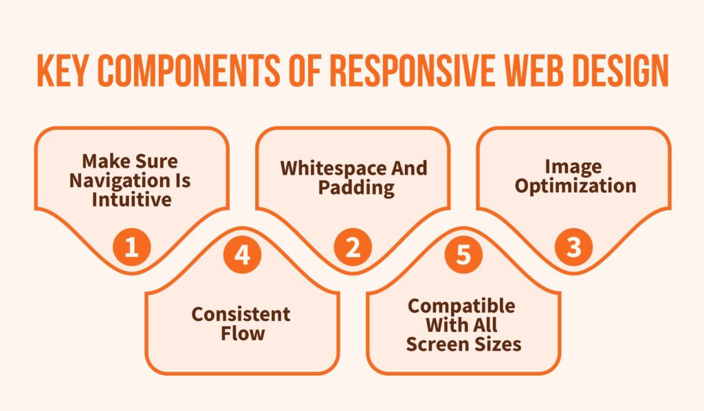
Key Components Of Responsive Web Design
As of 2015, the use of mobile phones and other devices increased, resulting in users browsing on their tablets, laptops, or cells. Since then, responsive design is no longer an option. It’s a necessity along with website speed for a brand to stand. Here are some key elements that a website must have.
Compatible With All Screen Sizes:
Any good web designer should be aware of how important it is to make their designs cross-platform compatible. During the design process, it is crucial to test your site on all relevant platforms to ensure optimal user experience.
Consistent Flow:
It’s important to provide a consistent browsing experience across different platforms if you want to avoid frustrating visitors. Make sure your navigation menu, contact information, and key content are all easy to find. A consistent experience will help reduce bounce rates and page abandonment.
Whitespace And Padding:
Most mobile users abandon a website because it appears too cluttered or misaligned on their devices. This can lead to a decrease in conversions, and also damage the reputation of both the website and business. To avoid this, website owners need to make sure that there is adequate padding and whitespace so that the design is not confusing on a small screen.
Image Optimization:
Optimizing your website’s images is important for a number of reasons. Engaging images make content more enjoyable to consume, they can help lower hosting and delivery costs, and they can even help improve search engine optimization on Google.
Make Sure Navigation Is Intuitive:
Make sure that navigation is easy and convenient. All menus should be clearly visible and easy to access. Keep in mind that navigation menus may be altered on different devices, depending on factors like size and resolution. This can impact the user experience across your website on various platforms.
Tools For Testing

Once you are done designing your site, it’s time to recheck it for errors. There are certain online tools that allow you to check your designs for free.
ScreenFly:
ScreenFly is a cost-effective way to test the responsiveness of your website. You can select the resolution for which you want to check your website, and you will be given a preview of your web page on different devices. Desktop computers, tablets, TVs, and cellphones are some of the featured gadgets.
Am I Responsive?:
Am I Responsive is a website that allows you to check the responsiveness of your own site. While it is not pixel-perfect, it is still a valuable tool to use to get an idea of how your site looks on different devices. You can even preview projects that you are building locally on your computer, which is an amazing pro.
Designmodo Responsive Test:
DesignModo’s interface is quite convenient and intuitive as you do not have to change the browser window, it is fully resizable and draggable. The page’s top has a fixed ruler and a manual input area for scaling. Additionally, it offers drop-down options for typical devices like tablets and smartphones.
Responsinator:
Responsinator is a helpful site for gauging how responsive your site is. You can also use it to check how well your locally built projects display on common devices, such as iPhones, iPads, and Android Nexus devices. The site is easy to use and navigate; it presents several device silhouettes one after another for previewing purposes.
Conclusion
The web is changing, there’s no denying that. Mobile devices are now the standard method of web browsing and a responsive website design is the best strategy to ensure your website is user-friendly and up-to-date. A responsive design offers your clients the opportunity to view your website on any device with ease. The more devices you can connect with, the more engaged your audience is likely to be. Some good indications of a web design are the width of the content, the loading time of a page, and more. That’s why responsive web design is worth it.